Rapidly build modern web apps with
The Most Powerful Bootstrap 5.3 Admin Template
Medicare Admin Template is a popular open source WebApp template for admin dashboards and control panels. It is a responsive HTML template that is based on the CSS framework Bootstrap 5 It utilizes all of the Bootstrap components in its design and re-styles many commonly used plugins to create a consistent design that can be used as a user interface for backend applications. Admin Template is based on a modular design, which allows it to be easily customized and built upon. This documentation will guide you through installing the template and exploring the various components that are bundled with the template.
Structure
I have tried my best to have standards and modular structure while developing the theme. Following sections are explaining the theme File & Folder, structure, html file struture and plugins.
File & Folder Structure
   Theme Directory

   main-file/

	│
	├── HTML
	│	│
	│	├── assets/
	│	│	│
	│	│	└── icons
	│	│	│	└── All Icon font files
	│	│	│
	│	│	└── vendor_components
	│	│	│	└── All Third party components plugins File with Sourcs
	│	│	│
	│	│	└── vendor_plugins
	│	│		└── All plugins
	│	│
	│	├── images/
	│	│	│
	│	│	└── All Images Here
	│	│
	│	├── template (All other pack demo as same)
	|	|	|
	|	│	├── vartical
	|	│	│	│
	|	│	│	└── main
	│	│	│	│
	|	│	│	└── main-dark
	│	│	│	│
	|	│	│	└── main-dark-rtl
	│	│	│	│
	|	│	│	└── main-mini
	│	│	│	│
	|	│	│	└── main-mini-dark
	│	│	│	│
	|	│	│	└── main-mini-dark-rtl
	│	│	│	│
	|	│	│	└── main-mini-rtl
	│	│	│	│
	|	│	│	└── main-rtl
	│	│	│
	|	|	|	│
	|	│	│	└── src
	|	|	|	|	└── css
	|	|	|	|		└── All css files.
	|	|	|	|	└── js
	|	|	|	|		└── All js Files pages
	|	|	|	|	└── scss
	|	|	|	|		└── All sass files.
	|	|	|
	|	│	│
	|	│	└── horizontal
	|	│	│	└── main
	|	|	|	└── main-dark
	|	|	|	└── main-dark-rtl
	|	|	|	└── main-rtl
	|	|	|
	|	│	│	└── src
	|	|	|	|	└── css
	|	|	|	|		└── All css files.
	|	|	|	|	└── js
	|	|	|	|		└── All js Files pages
	|	|	|	|	└── scss
	|	|	|	|
Installation Guide
First of all, choose you desire folder & copy that folder and also copy that assets folder.
example : In HTML Folder template(choose your demo) + assets (Required) + images (Required) = Enjoy your demo.
Note!
Template Sass(scss) file only for {color_theme.css, skin_color.css, style.css, style_rtl.css} include. Template Sass(scss) File source in (scss folder)Other Third party plugins Sass File not include. You can Find Third party plugins Sass file from plugins website.
Dependencies & Plugins
Dependencies
Template depends on two main frameworks. The downloadable package contains both of these libraries, so you don't have to manually download them.
Plugins
ethos makes use of the following plugins. For documentation, updates or license information, please visit the provided links.
Editors
- Bootstrap WYSIHTML5
- CK Editor
- ACE Editor
Layout
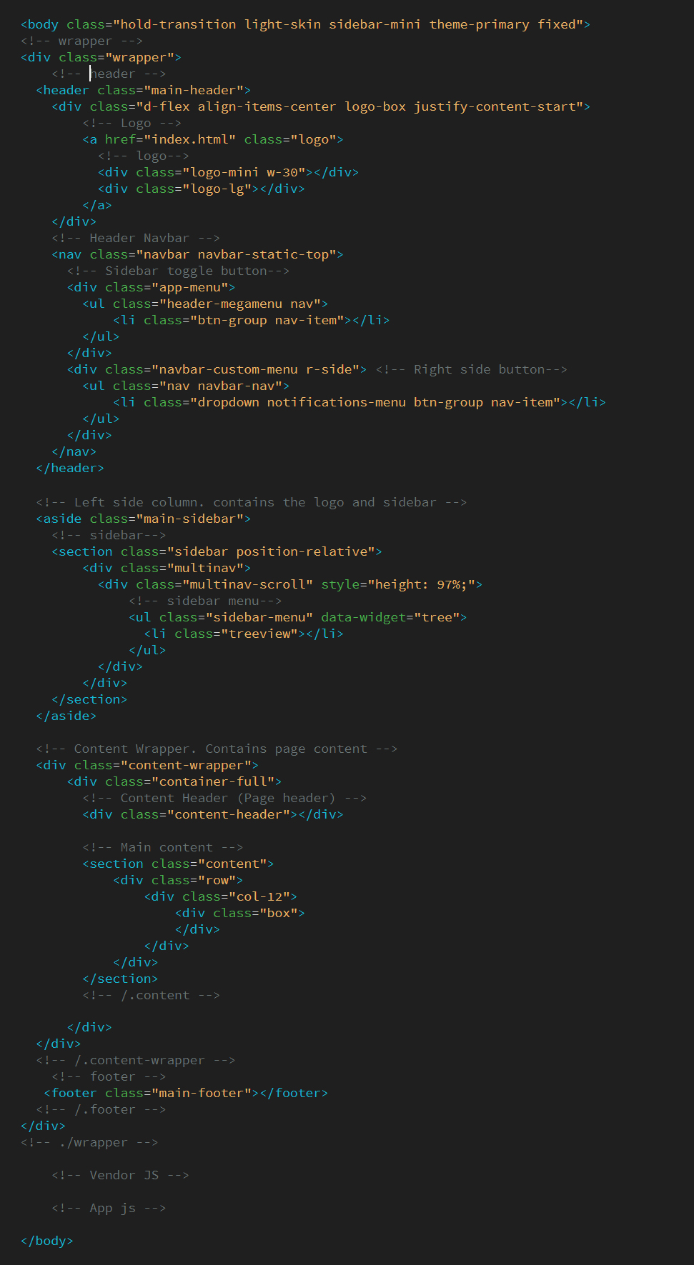
The layout consists of four major parts:
- Wrapper
.wrapper. A div that wraps the whole site. - Main Header
.main-header. Contains the logo and navbar. - Sidebar
.main-sidebar. Contains the user panel and sidebar menu. - Content
.content-wrapper. Contains the page header and content.
Layout Options
Note!
You cannot use both layout-boxed and fixed at the same time. Anything else can be mixed together.
We provides a set of options to apply to your main layout. Each one of these classes can be added to the body tag to get the desired goal.
- Fixed: use the class
.fixedto get a fixed header and sidebar. - Collapsed Sidebar: use the class
.sidebar-collapseto have a collapsed sidebar upon loading. - Boxed Layout: use the class
.layout-boxedto get a boxed layout that stretches only to max width 1850px.
RTL Ready
RTL Version
File Location: css/style_rtl.css
But all css file link so you can just add class in body tag class:rtl
Note! (For horizontal demo rtl)
For RTL Demo add Class in body tag class:rtl
For Nav RTL add Class in <ul id="main-menu" class="sm sm-blue under nav tag sm-rtl"> class:sm-rtl
Dark Version Ready
Dark Version
all css file link so you can just change class (light skin to dark skin) in body tag class:dark-skin
HTML Structure View

Box/Card Component (HTML)
The box/card component is the most widely used component through out this template. You can use it for anything from displaying charts to just blocks of text.
Below code is used at the box/card component of all HTML pages
<div class="box">
  <div class="box-header with-border">
	<h4 class="box-title">Box <strong>slided up</strong></h4>
	<ul class="box-controls pull-right">
	  <li><a class="box-btn-close" href="#"></a></li>
	  <li><a class="box-btn-slide" href="#"></a></li>
	  <li><a class="box-btn-fullscreen" href="#"></a></li>
	</ul>
  </div>

  <div class="box-body">
	 <p>Ut vestibulum enim vitae elit luctus, id tincidunt metus suscipit. </p>
  </div>

  <div class="box-footer">
	 <p>Ut vestibulum enim vitae elit luctus, id tincidunt metus suscipit. </p>
  </div>
</div>
<div class="card">
  <div class="card-header">
	<h4 class="card-title">Box <strong>slided up</strong></h4>
  </div>

  <div class="card-body">
	 <p>Ut vestibulum enim vitae elit luctus, id tincidunt metus suscipit. </p>
  </div>

  <div class="card-footer">
	 <p>Ut vestibulum enim vitae elit luctus, id tincidunt metus suscipit. </p>
  </div>
</div>
Sidebar Tree Plugin (JS)
The tree plugin converts a nested list into a tree view where sub menus can be expanded.
Usage
This plugin can be activated using the data-api or jQuery.
Data API
Add data-widget="tree" to any ul or ol element to activate the plugin.
<ul class="sidebar-menu" data-widget="tree">

	<li>
	  <a href="charts_chartjs.html">
		<i class="ti-stats-up"></i>
		<span>ChartJS</span>
	  </a>
	</li>

	<li class="treeview">
	  <a href="#">
		<i class="ti-view-list"></i>
		<span>Multilevel</span>
		<span class="pull-right-container">
		  <i class="fa fa-angle-right pull-right"></i>
		</span>
	  </a>
	  <ul class="treeview-menu">
		<li><a href="#">Level One</a></li>
		<li class="treeview">
		  <a href="#">Level One
			<span class="pull-right-container">
		  <i class="fa fa-angle-right pull-right"></i>
		</span>
		  </a>
		  <ul class="treeview-menu">
			<li><a href="#">Level Two</a></li>
			<li class="treeview">
			  <a href="#">Level Two
				<span class="pull-right-container">
		  <i class="fa fa-angle-right pull-right"></i>
		</span>
			  </a>
			  <ul class="treeview-menu">
				<li><a href="#">Level Three</a></li>
				<li><a href="#">Level Three</a></li>
			  </ul>
			</li>
		  </ul>
		</li>
		<li><a href="#">Level One</a></li>
	  </ul>
	</li>

  </ul>
Control Sidebar Plugin (JavaScript)
The control sidebar component is part of layout as the right sidebar.
Usage
This plugin can be activated using the data-api or jQuery. To activate the plugin, you must first add the HTML markup to your layout, then create the toggle button as shown below.
HTML Markup
<!-- Control Sidebar -->
<aside class="control-sidebar control-sidebar-dark">
  <!-- Content of control sidebar goes here -->
</aside>
<!-- /.control-sidebar -->
<!-- Add the sidebar's background. This div must be placed
  immediately after the control sidebar -->
<div class="control-sidebar-bg"></div>
Data API
Add data-toggle="control-sidebar" to any button or
a element to activate the plugin.
All options can be passed using the data api. Example: data-slide="false".
HTML Markup
<a href="#" data-toggle="control-sidebar">Toggle Control Sidebar</a>
JQuery
You can also activate the toggle button using jQuery by running the following example.
$("#my-toggle-button").controlSidebar(options);
SCSS & CSS
Following are the stylesheet files:
| File | Description |
|---|---|
bootstrap.min.css
|
bootstrap v5.x.x. The core bootstrap ile is being used in all the pages. |
color_theme.css
|
Combines various Color for template color style. it's generated from scss |
skin_color.css
|
Light and dark skin style. it's generated from scss |
style.css
|
The main stylesheet file, it's being generated from scss and contains all the css styles combined. |
style_rtl.css
|
This style sheet for RTL. it's generated from scss |
vendors_css.css
|
All vendors plugins style link thik this stylesheet. it's generated from scss |
Javascript
we uses jQuery, Bootstrap JS framework(at its core) and some of the third-party plugins. There are may more third party plugin which you can use according to your needs. The css is already containing matching style for these plugins so you will not need to do anything around it.
They are explained below:
| File | Description |
|---|---|
vendors.min.js
|
This is a combine of jquery.js, bootstrap.js, popper.js, jquery-slimscroll.js, screenfull.js, jquery.sparkline.js, perfect-scrollbar.js |
template.js
|
This is a main js file. It contains the custom JS code needed for features including layout, sidebar, etc. |
pages/*.js
|
These are the files containing pages specific code. They are mainly used for demo purpose. |
Browser Support
Note!
IE does not support.
Supports the following browsers:
- Edge (latest)
- Firefox (latest)
- Safari (latest)
- Chrome (latest)
- Opera (latest)
Creadits
- Bootstrap
- Jquery
- Font-Awesome
- ionicons
- ChartJS
- Flot
- Morris.js
- Sparkline
- Bootstrap Slider
- Ion Slider
- Date Picker
- Date Range Picker
- Color Picker
- Time Picker
- Input Mask
- Bootstrap WYSIHTML5
- CK Editor
- DataTables
- Full Calendar
- jQuery UI
- jQuery Knob
- jVector Map
- Slim Scroll
- Pace
- Bootstrap-timepicker
- Bootstrap Colorpicker
- Select2
- Pexels (images)
- Weather Icons
- Magnific Popup
- lightbox master
- Sweetalert
- ACE Editor
- Form Validation
- Form Wizard
Support
If you need any help or feel any query don't hasitate just mail us (with licence key) on hello@multipurposethemes.com, we would love to help you, Once again thanks for purchasing the template, i hope you enjoy it. Thanks


